Tuesday, December 1, 2009

Illustrator Collage


Finally made a collage on illustrator. I used live trace, gradient tool, and stylizing effects, among other things. Like it?
I put a picture of myself wearing my clip in my hair, live traced a pic of my clip on my boombox purse, put some of my text logos in there. I wanted a visual impact.

Re-making my logos


I really didn't like my logos, so I made a few more. And now I have 3 that are just images, 3 that are just text, and 3 that are a combination of text and a graphic. I like the 3rd one the best. Clearly, I'm not a graphic designer.

Wednesday, October 28, 2009

Wallpaper and articles.


Since we're making a zine for our final project, I need a background for it. We had to make a background using one of our logos. This is what I came up with.

I'm not sure which posts I'm supposed to include articles about my subject, but these two articles have been saved in a draft on this blog for a few weeks now, so I'm just going to post them.

article about using sunflower oil as a green kind of fuel

this tells you everything you ever wanted to know about sunflowers

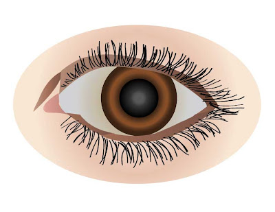
Eyeball


I traced a drawing of my eye with the pen tool in illustrator. For some reason when I uploaded it it turned blue. That's never happened to me before.


Okay that time it worked.

Wednesday, October 21, 2009

sunflower logos


These are my logos made with Illustrator.

Tuesday, October 6, 2009

Anything went


Collage portraying something about my object....
This is a sunflower city, a night world. Fascination with the sunflower (they are looking at the sky or each other with flowers in their hair), feminine, mysterious. This is the mood or ideas my collage generates. I like the visual impact.

Links to the images I used:
city background
girl in bottom right corner
women in the pillars
sunflower in woman's hair
The girl in the center is a picture I had saved on my computer from before, so I can't find a link.

Tuesday, September 29, 2009

Adjustment Layers


I had to make the image from last week look better, so I brightened it a bit. It was already in focus, so there wasn't much to do.


Then I had to edit it in an unusual way, so that's what I did.


I know, it's hideous, but the first had to be monochromatic, second the subject and background contrasting colors, third one mess with saturation, and fourth one brighten the image. I like the green monochromatic, because green is associated with nature and this is in the woods. I used different adjustment layers to edit these.

I'm extremely tired and running on two hours of sleep, so my descriptions suck. Pardon me. Goodnight!